

Authors: Mary Ellen Dello Stritto & Dana Simionescu
What We Did and Why
When we design online courses, we make hundreds of small decisions about where to put things or how to introduce them. Should assignment instructions come before or after the readings? Does anyone look at the Module Learning Outcomes? Most of these calls get made on how we know people learn, what we think learners do, or what the program has always done, but rarely on concrete evidence about how students actually move through a Canvas course.
So, we asked them. During Winter 2026, we surveyed 463 Oregon State University Ecampus students about how they navigate Canvas, where they look for information, how they engage with course elements, and what they wish we’d do differently. Respondents were experienced online learners, so the patterns below reflect habits built up across various courses and instructors.
Some results confirmed what we suspected. Others were genuinely surprising. Below are the takeaways we think are most useful for instructors and instructional designers.
Takeaways
- Consistency across courses is what students wanted most.
When we asked students about improvements they wished for, the most common answer was about consistency. Students described spending the first weeks of every term re-learning each instructor’s idiosyncratic Canvas setup rather than focusing on the course content itself.
This is a hard problem because instructor autonomy is real and valuable, but it points to a clear opportunity: shared design elements and practices within a program or department go a long way. Even standardizing a few things—where the syllabus lives, a common module structure, consistent naming for module pages—reduces the cognitive load students carry from course to course. This is a strong argument for using course design templates.
- For most students, the Modules page was the front door.
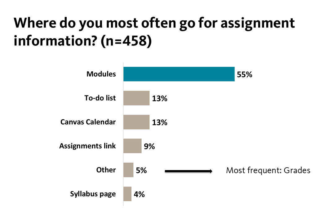
The clearest finding from the survey: most students lived in the Modules page. When asked where they go to find assignment information, 55% said the Modules page. When asked what they do first when starting a new module, 72% said they go to the Modules page and click the first item.
But it’s worth noting that a substantial minority of students navigated primarily via the To-Do list, the Canvas Calendar, the Grades page, or other tools. This is often because they’re managing a heavy course load and prioritize by due date across all their courses rather than working through one module at a time. The Modules page is the dominant pathway, but it’s not the only one, and a well-designed course needs to support both behaviors.
This suggests a few practical instructional design moves:
- Make the Modules page complete and self-contained. Anything important (instructions, rubrics, readings) should be reachable from a module. If it isn’t in (or linked from) Modules, most students won’t find it.
- Set module requirements for key pages. Canvas allows you to require students to “View” or “Mark as done” specific items in a module. This helps ensure students see important pages they might otherwise skip, and it activates the progress indicators on the Modules page—which several students specifically asked for, as a way to track what they’ve completed.
- Sequence matters. About 71% of students report always or often going through module items in the order presented, so the order you set is the order most students will follow.
- The Calendar and To-Do list are critical infrastructure. Make sure everything is there.
When students manage workload across multiple courses, they rely on Canvas’s cross-course tools: the Calendar, the To-Do list, and the Grades page, which several students described as the most reliable place to see all assignments listed consistently.
The most actionable finding here is about due dates. Students reported that items are sometimes missing from the Calendar and To-Do list, which leads directly to missed deadlines. The single most-mentioned problem was discussion posts with two due dates (initial post + replies). When only one of the dates shows up in the To-Do list, students might miss the other.
A few concrete design ideas:
- Make sure every graded item has a due date entered in Canvas. This is what populates the Calendar and To-Do list for the students who navigate by deadline rather than by module sequence. This includes graded items that are completed in an external platform.
- Consider adding “to-do dates” to non-assignment pages like learning materials or assignment overview pages. Canvas lets you assign a to-do date to a page so it appears in students’ To-Do lists alongside graded items. This brings important non-graded content into the deadline-driven navigation paths some students rely on.
- For discussions with two post deadlines, use Canvas’s new discussion checkpoints feature, which lets you set separate due dates for initial posts and reply posts. They’ll appear as distinct items in students’ To-Do lists and Calendars, which is exactly what students in the survey were asking for.
- What students actually read (and what they didn’t).
Of all the course elements we asked about (announcements, rubrics, assignment purpose statements, and module learning outcomes), rubrics came out on top across every measure: 80% of students read them always or often; 89% rated them useful or very useful; 55% checked the rubric specifically when looking for feedback on a graded assignment.
By contrast, module learning outcomes had the lowest engagement of any element we asked about. Only 45% of students read them always or often, and only 45% found them useful. About 15% rated them not at all useful. It might be worth experimenting with how outcomes are presented, where they appear, or how they’re connected to specific activities.
While announcements are the most consistently read course element in the survey (78% always or often), about 22% of students read them only sometimes or never, a significant subset of students. This suggests you should not put essential, course-critical information only in an announcement. Deadline changes, an assignment clarification, a required reading update— these need to exist somewhere durable in the course such as the module itself, the assignment page, or the syllabus in addition to any announcement you send.
- Students often previewed assignments before doing the readings.
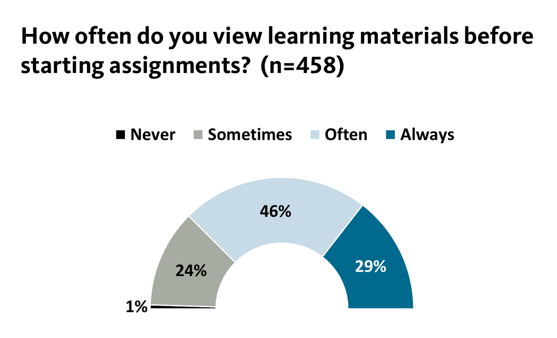
About 75% of students indicated they always or often complete learning materials before starting an assignment, which is reassuring. But the open-ended responses complicated the picture: many students described previewing the assignment first, then working through the readings and videos with a clearer sense of what to focus on.
This is a reasonable strategy, and the design implication is about making the connection between learning materials and assignments explicit. When students preview an assignment, you want them to be able to tell, quickly, which readings and videos actually prepare them for it. Call that connection out directly on the assignment page, in the learning materials, or both! That will help students study with purpose.
- Course introduction materials were valued and used as ongoing reference.
In our Ecampus courses at Oregon State University, the introductory section is called the “Start Here” module, and nearly all students (94%) engaged with it. The specific format will vary by institution and program, but the underlying behavior is informative regardless of what you call your opening module.
A couple of patterns stood out:
- Students returned to introductory materials throughout the term, not just at the start. They come back to look up course-specific information they need: the syllabus, grading policies, instructor contact info, the schedule, materials lists. Whatever you put in your opening module, students are treating it as a reference document rather than a one-time orientation.
- Students valued course-specific information, rather than repeated institutional or platform content. Several experienced students described feeling that intro materials contain too much familiar content such as generic LMS tutorials, university-wide policies, boilerplate language that doesn’t change from course to course. They indicated that the genuinely useful course-specific information sometimes gets buried.
The takeaway here is that the introductory part of a course functions as a course-specific reference, so the design move is to make the truly course-specific content (your syllabus, schedule, assignment overview, contact info, policies) easy to find and return to—and to be thoughtful about how much repeated cross-course content shares that space.
- Mobile is for monitoring, not learning.
Our results showed that mobile usage was widespread but specific in purpose: 78% of students checked grades on their phones, 70% checked due dates, and 62% read announcements. But only 8% took quizzes, 8% completed assignments, and 13% participated in discussions on mobile devices.
The pattern is clear: students used phones to monitor and plan and they used computers to actually do the work. These results suggest you probably don’t need to redesign assignments to be mobile-first, but the quick-check pathways (grades, due dates, announcements) should be especially clean and reliable.
- Feedback is sought but hard to find consistently.
94% of students checked the gradebook Comments box for feedback. Roughly 59% also looked at annotated comments on the assignment, and 55% checked the rubric. Very few students skipped feedback entirely.
They told us the challenge is location. Students described frustration that feedback is input in different places depending on the instructor and the course. One student indicated they didn’t even realize that annotated comments existed.
If you use annotations or rubric-based feedback, tell students explicitly where to look for that feedback, ideally early in the term and again when the first graded assignment returned. Consider a dedicated section in your starting module, and/or a one-sentence announcement after the first round of grading such as “Your feedback is in three places: the Comments box, annotations on your submission, and the rubric.” This can save students from missing substantial parts of instructor feedback.
- Keep modules unlocked when you can.
Several students specifically asked for modules to remain unlocked so they could work ahead when they knew a busy week was coming. Locked modules were described as a barrier to time management, especially for students juggling multiple courses, work, and other obligations.
There are legitimate pedagogical reasons to release content sequentially: scaffolding, preventing students from getting overwhelmed, keeping a cohort moving together for discussion-based learning. But if you’re locking modules by default rather than for a specific reason, it’s worth reconsidering. Unlocked modules let the students who want to plan ahead do so without preventing anyone else from working through the course at the standard weekly pace.
Conclusion
If we had to compress the survey into one sentence for course designers, it would be this: students want predictable, modules-centered courses where everything they need is reachable from one place, due dates are accurate and consistent, and feedback is easy to find.
If you’re doing similar work at your institution or experimenting with any of these changes in your own courses, we’d love to hear about it.